case study ui/ux
warframe foundry redesign
This redesign was created as a personal UX/UI design exercise and portfolio piece. I have a lot of love and respect for Warframe and the team at Digital Extremes. This project isn’t intended as criticism of the original design, but rather as an opportunity to explore alternative solutions and learn from a game I love.
Tools I used:

— 01. explanations
Redesigning is a Challenge
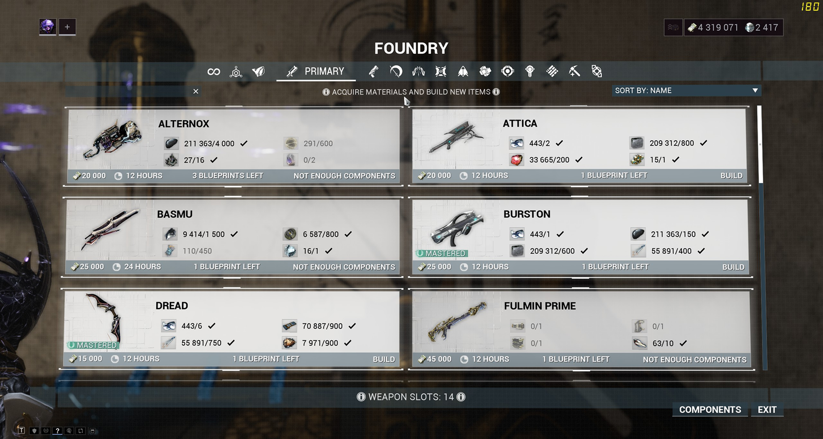
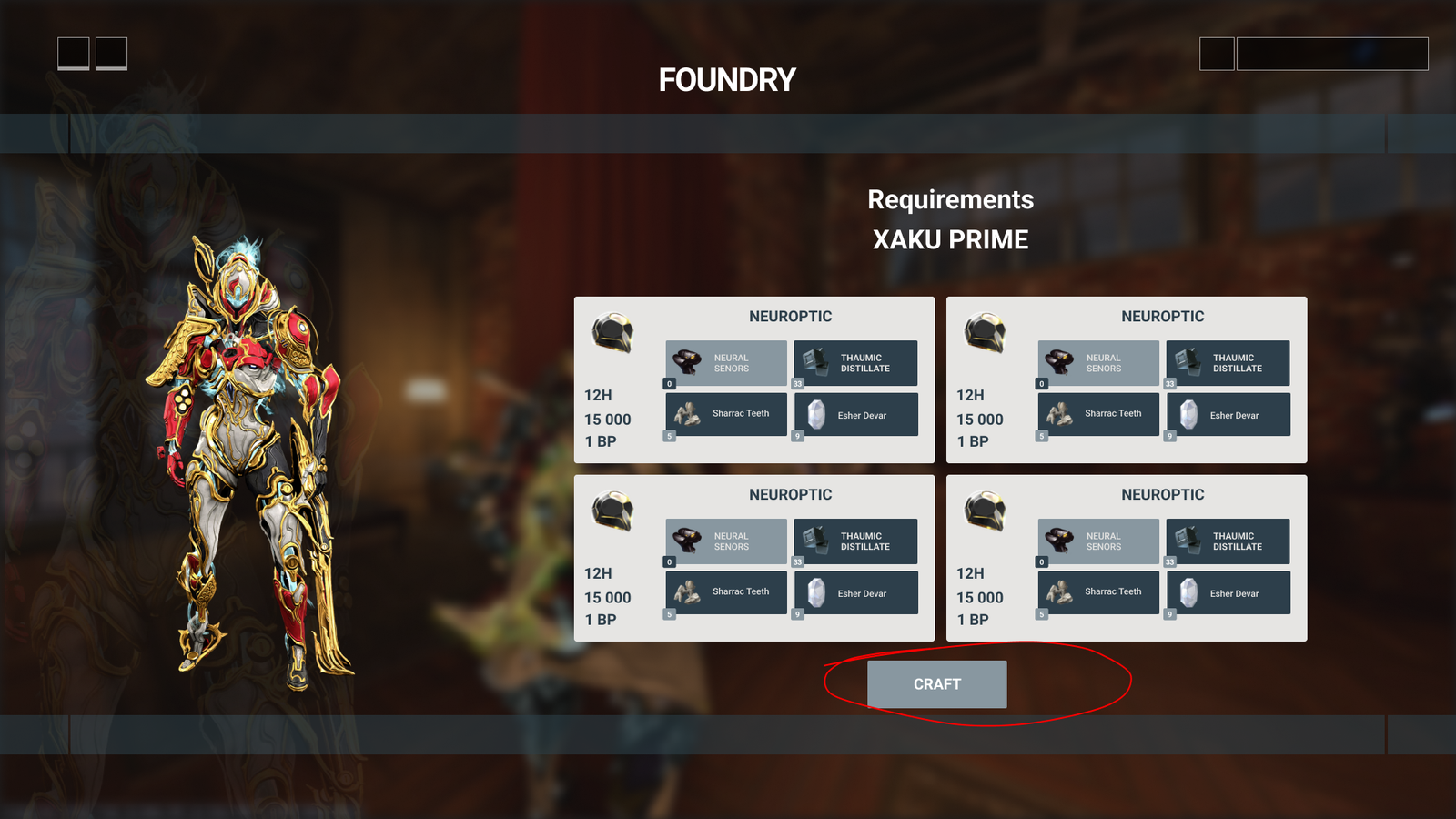
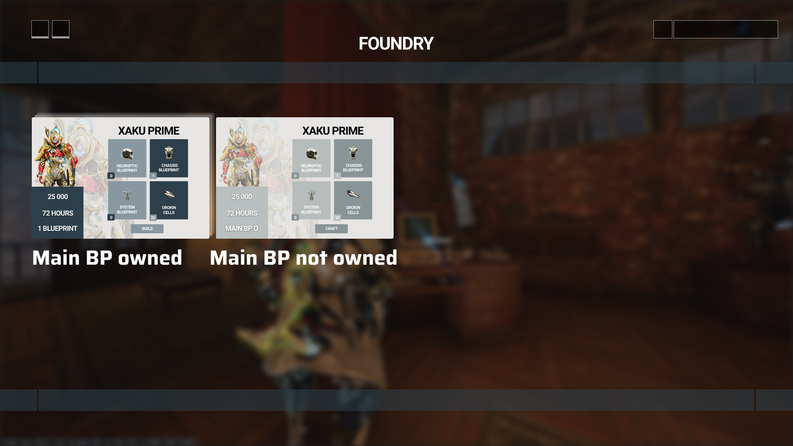
A few months back I decided to have a closer look at the design of the Foundry in Warframe, being a player with more or less 860+ hours, I wasn’t paying attention to the way it worked anymore but still, a few things were annoying me when it came to the foundry, details that I knew could be changed for the better. Warframe being one of my favorite games to spend time on, I enjoyed imagining what could have been improved and how to push the boundaries of the already existing design.
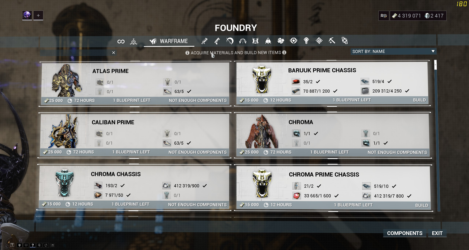
I quickly realized that I had underestimated the amount of work involved on such a redesign project. The foundry in Warframe is used to do many things, primarily to build warframes but not only: weapons, secondary equipment and so on so I decided for the purpose of this redesign to focus on the warframe part of the foundry.
The already established and working foundry system wasn’t flawed or anything, it just needed improvement on a UX (User Experience) side and better legibility on the UI (User Interface) side.
1
Design Goal : Reduction of frictions
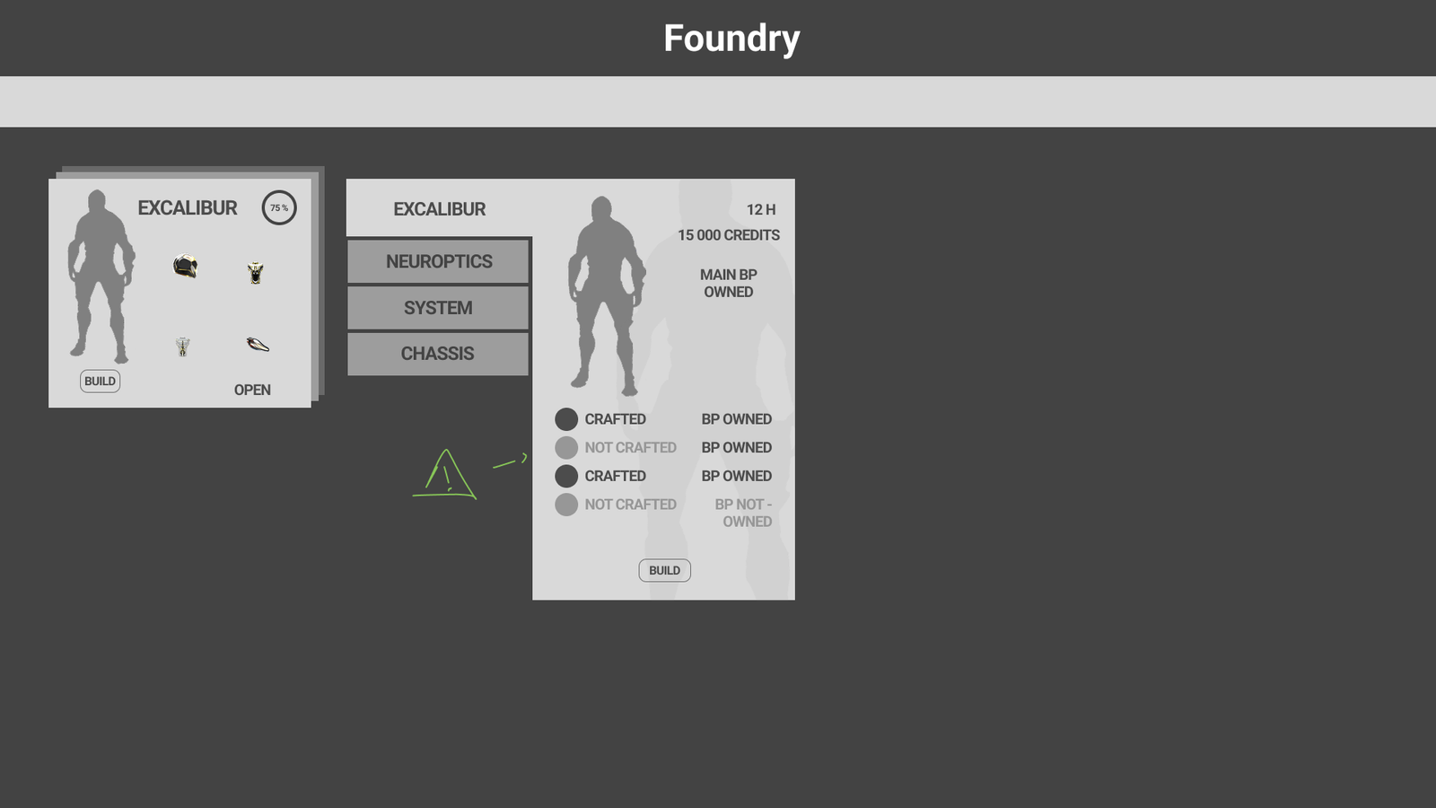
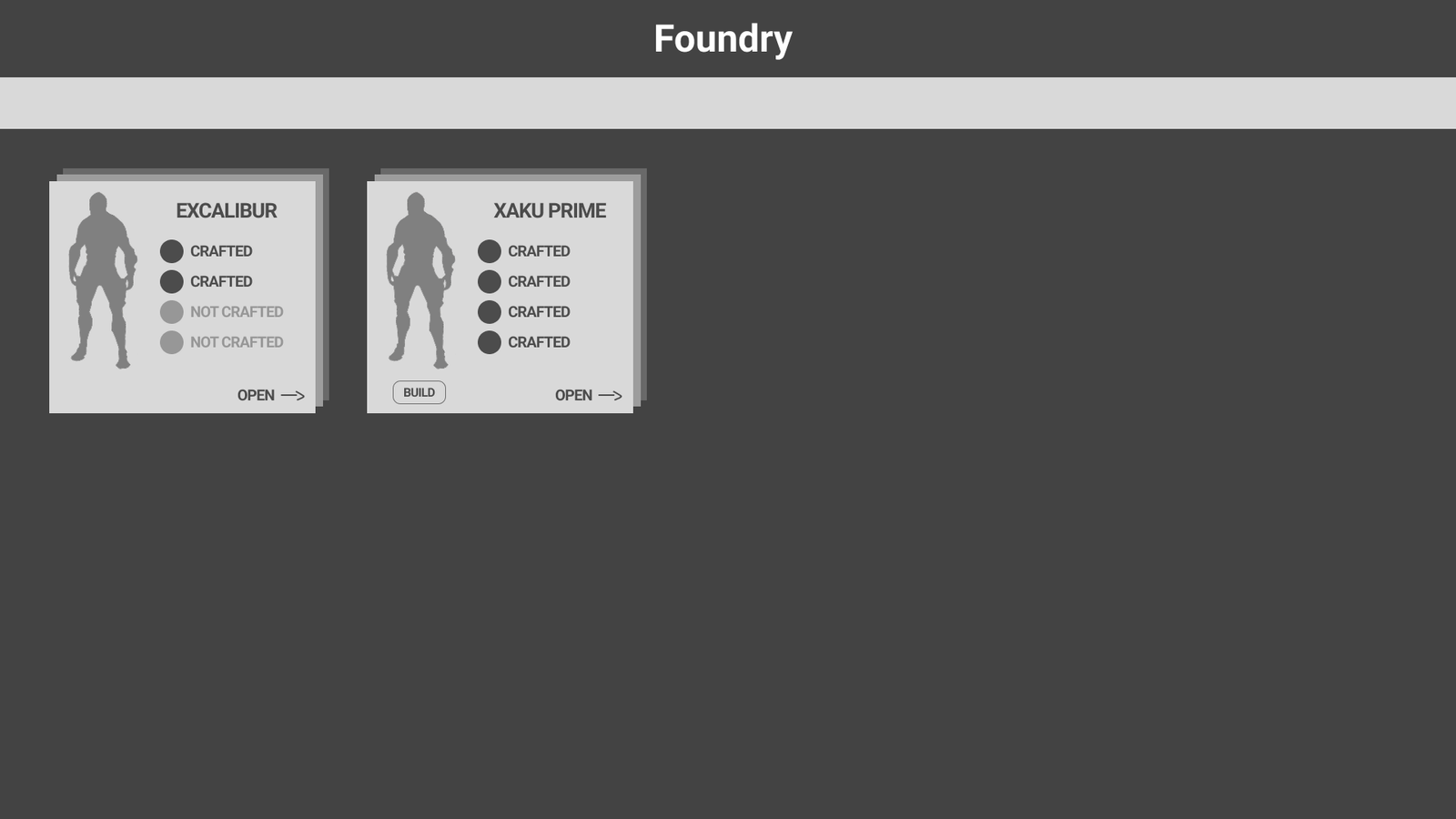
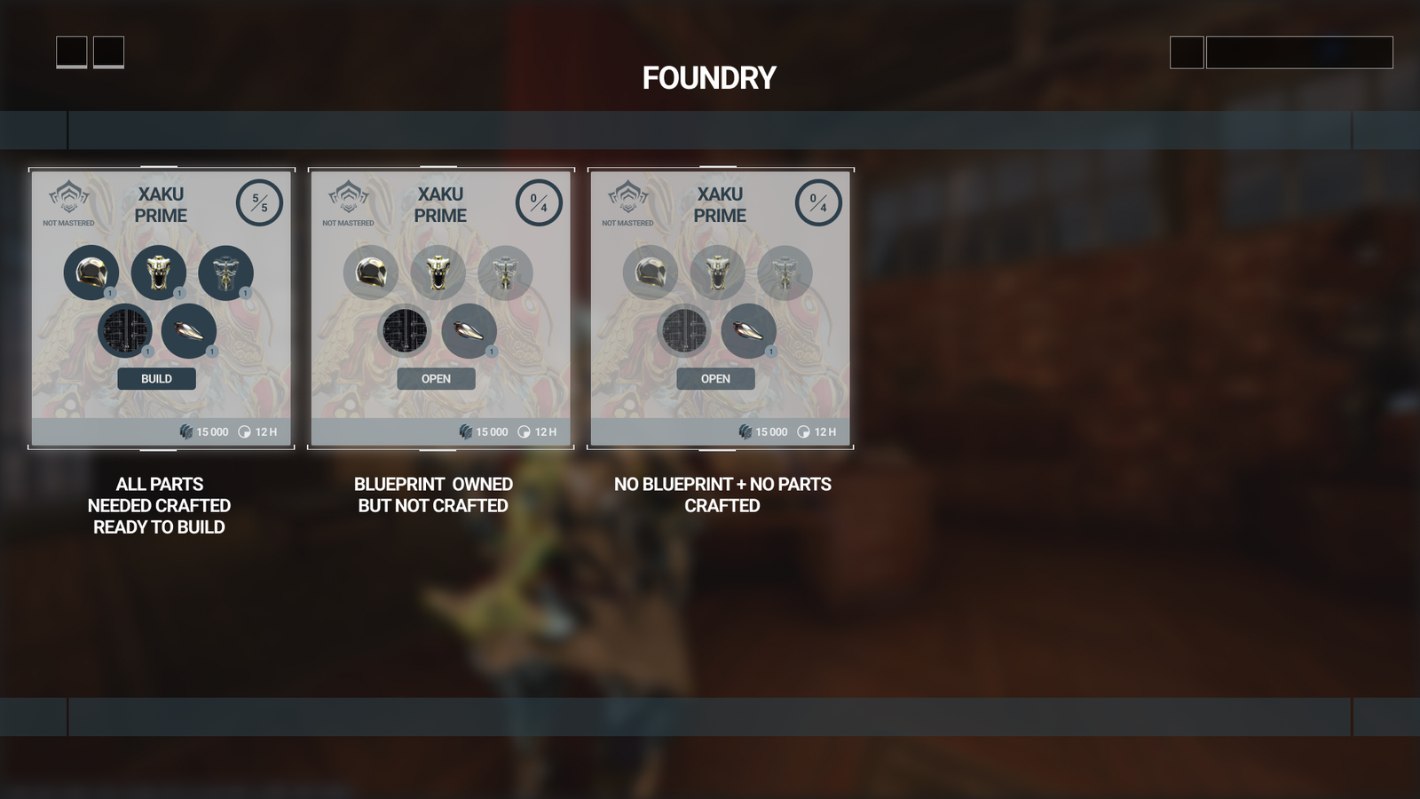
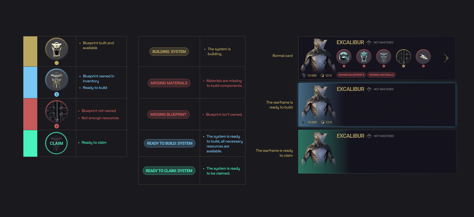
By reducing cognitive load with small details such as adding an icon for an already mastered item of putting a tag system in place for the different states of a craft.
2
Design Goals : Improving clarity
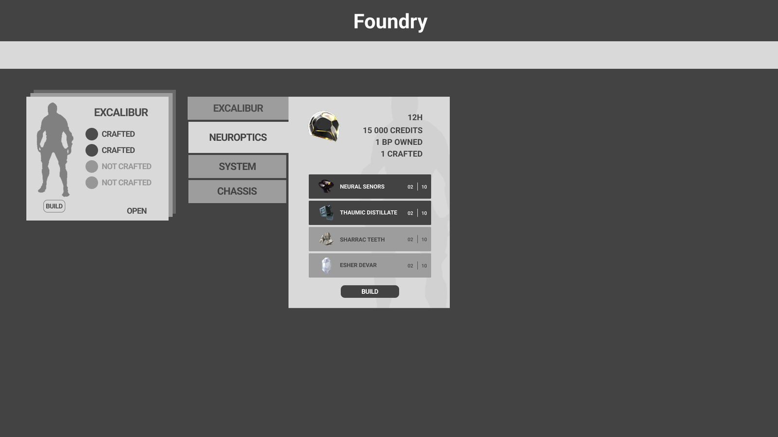
Improving crafting clarity by reorganizing the Foundry around what the player wants to build with a set oriented navigation.
— 02. user researchs
Finding the frictions
My choices for this redesign are the result of many reflections and tests done with a few veteran players of Warframe as well as some newcomers, one of the main challenges was to find a design well-suited for veterans as well as new players so as to guide them and make the learning curve for the Foundry easier but also not frustrate veterans with a design they are not used to and do not wish to use.
To be sure that I was aware of the main frictions I did not only consider my own experience of the game but also the different ‘rants’ a few players gladly decided to share on Reddit.
Results of this observation:
Reading all the comments on the already existing system, it reinforced my analysis and observations on it. The need for a UI/UX rework was clear.
The two main axes of improvement were:
- Better visibility and clarity of what was already mastered or not.
- A set-oriented navigation system, less friction in having to find the different parts and components the player wants to craft in order to craft a whole warframe.